
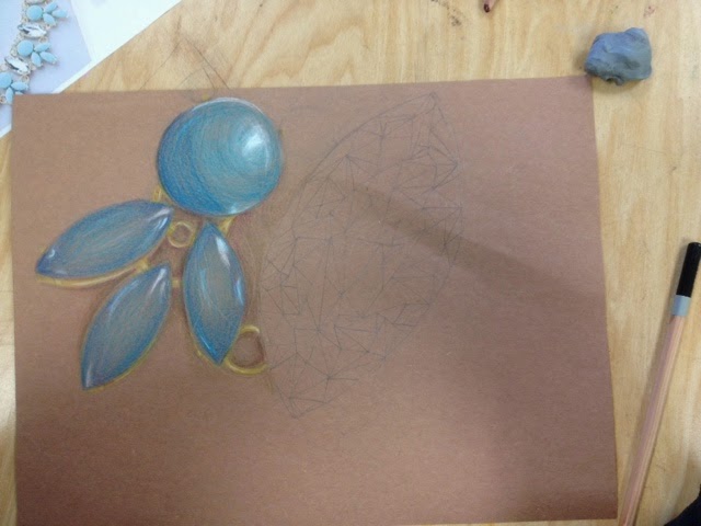

For the up close project I chose to do an up close picture of a necklace in color pencil. I am happy with the blue part of the necklace. The edges are darker, and I added bright highlights to give it dimension. To get the color right, I used a mix of brighter light blues, and darker purple blues. This gave me a chance to practice blending colors and layering with color pencils. I tried to challendge myself by drawing the diamond, but the way I colored it made it look flat. I tried to add bright spaces and shadows, but the placement was wrong and it did not add dimension like I was hoping it would.I also wish I had spent more time on the gold inbetween the sections of the necklace. They are not very defined, and they are one color. To improve it I would make sure they had a defined edge, and I would go back and add shading and highlights to make the prices stand out, instead of being flat and blending into the page.
No comments:
Post a Comment