Friday, December 5, 2014

Clay sushi


  For this project we had to make clay food that you would eat for lunch. I chose to do sushi because of the bright colors and different textures it's has. To create this texture and shape made the separate pieces, then put them together. I cut each grain of rice and each price of mean. The crab meat in top of the roll is all separate prices too. When I was making the salmon I didn't make it perfectly shaped, and I carved ridges into the fish to make it look more realistic. Then, when I was painting it, I added light pinks and dark salmon colors to give it dimension. For the roll pieces I started off will a small cylinder, then added the pieces of fish and rice on top. The wood slab that the sushi is on was the most difficult part to make. To add texture, I carved grain into the wood. The first time I painted it, I painted it one flat color. I went back and added to the wood grain with a darker brown to give it more dimension.
    Overall, I'm happy with the outcome of the project. If I were to improve it, I would I would add more dimension to the crab meat with darker pinks and highlights. I would also add more value to the rest of my clay. Because it is 3d, I did not think that I would need to add shadows and highlights, but it would make it look more realistic. I would also make the wasabi a lighter color green.

Monday, November 10, 2014

Color pencil, chalk pastel, oil pastel candy

 
    For this project we worked on drawing candies in their wrappers with different mediums. The most difficult drawings were the oil and chalk pastels. With the oil pastels, it is harder to layer colors. It was difficult to add highlight we shadow without smudging all of the colors together. Chalk pastels were easier to layer, but the colors smudge very easily. It is easy to over blend, and it is difficult to get straight edges. 
    My favorite medium to work with was color pencil. With color pencil it is easier to make drawing detailed. It was easy to layer colors, and highlights showed up nicely in the dark paper.

Friday, October 10, 2014

Edward Hopper

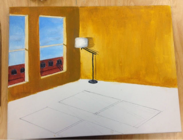
    For this project I painted a scene in the style Edward hopper would have. Hopper is known for his vibrant colors, use of architecture and geometric shapes, and the loneliness of his paintings. Because of this i painted a room that was completely empty except for one lamp in the corner. I also painted windows, another common hopper feature, looking out at buildings. Even though I was painting something to look like someone else's work, I still used my own references to create an original peice.
   Through this project I was able to learn new techniques and gain skill with acrylic paint. I learned how to evenly apply paint to the canvas and how to blend colors, to make the painting look smoother. If I could change anything I would have started with a wash, instead of a bare canvas. 

Tuesday, September 23, 2014

Perspective Drawing


                For this project I decided to go to Downtown Apex and take my own pictures of the Halle to use as a reference. I used two point perspective and tried to push the lights and the darks to show depth and to make the drawing more realistic. I used my own pictures and references from the internet to create an original piece, and I used negative space to keep the emphases on the building, and not its surroundings. It was difficult to keep the edges sharp and clean while shading, but after taking the time to neaten it up I am happy with the outcome.

Tuesday, June 3, 2014

Scratch board

For this project we had to pick something that shows movement or texture on a scratch board. I decided to do my dog because there is a lot of texture in his face, and I thought the direction of the fur would look good in the scratch board.

The most difficult part of this piece was making the shadows on his face, and the darker fur, look dark enough. Since I'm use to using pencil, and going from light to dark, it was difficult to go from dark to light. If you don't start out scratching to much, it will make you're piece too light and you can't fix it. Although the shadows are difficult the highlights are easy. To make the bright areas, like the eyes, I used cross bathing to remove as much black as I could to make it light.
Although it's isn't super detailed my favorite part of the piece is the eye. I like how it is the darkest part, but the bright highlight give it light and depth 

Gesture drawing

Gesture drawings are quick sketches just to map out people's body position and make them proportional. For this project we had people pose on a table and drew them from different angles. This was the first time I had tried to draw people, or figures, from life and I think it helped me better understand body proportions.Some challenges I had were making the body proportional and understanding that gesture drawings are not just an outline of the body. Since I was going so quick I would make the legs too short and the torso too long. The arms were always a different length too. Then I learned that the legs are twice the length If the torso.
My favorite part about these gesture drawings was that they were so quick, but you could make them as detailed or sime as you wanted. I like how they all have the same basic shape, and outline, no matter who you are drawing.

Figure drawing

    For this project we were supposed to do a life sized drawing from life. Some challenges I had were proportion, spacing, and shading with charcoal. The face was difficult because when you're drawing from life things are constantly moving and it is hard to capture just one face that they make. The body was also difficult. With a photo you can section it off and make proportions easier, but you can't from life. Shading was difficult because the charcoal was so dark that I was afraid I could make the entire thing black.
    While working with charcoal I think I gained some skill with a familiar media. I had used it before but never for a project this big. By doing this I think I learned how to better control the charcoal pencil and add value, not just color in the shapes.
    My favorite part of the drawing is the folds In her pants, and my least favorite is her eyes, because they look dead and unproportional.