Bailey's Art
Wednesday, January 7, 2015
visual journal
For the visual journal I used paint, gesso, cloth, and magazine cutouts. I started with the circle cutouts and the doyle and it reminded me of my grandmas house so that was my theme. I picked things that looked aged, and I used a lot of browns and reds. I tried to lay beads in gesso to create texture, but it ended up just looking like a white paint stripe. I transferred the wood and newsprint with tape, and I was happy with the outcome. Below the fabric I tried to transfer a picture with gesso, but it did not work so I covered it with cloth.
Wednesday, December 17, 2014
visual journal
For the visual journal I used paint, gesso, cloth, and magazine cutouts. I started with the circle cutouts and the doyle and it reminded me of my grandmas house so that was my theme. I picked things that looked aged, and I used a lot of browns and reds. I tried to lay beads in gesso to create texture, but it ended up just looking like a white paint stripe. I transferred the wood and newsprint with tape, and I was happy with the outcome. Below the fabric I tried to transfer a picture with gesso, but it did not work so I covered it with cloth.
Friday, December 5, 2014
Up close

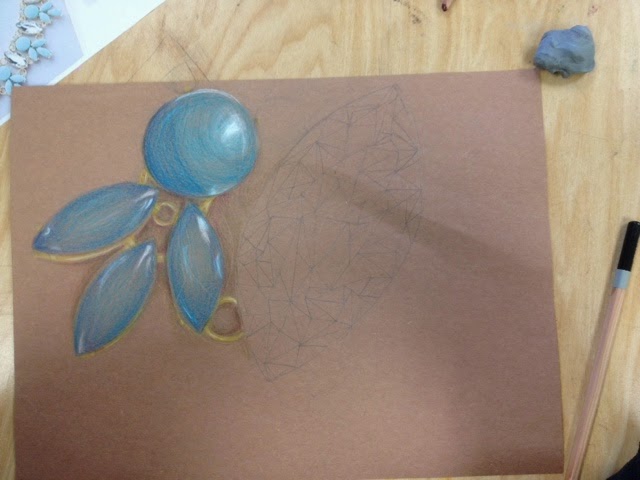
For the up close project I chose to do an up close picture of a necklace in color pencil. I am happy with the blue part of the necklace. The edges are darker, and I added bright highlights to give it dimension. To get the color right, I used a mix of brighter light blues, and darker purple blues. This gave me a chance to practice blending colors and layering with color pencils. I tried to challendge myself by drawing the diamond, but the way I colored it made it look flat. I tried to add bright spaces and shadows, but the placement was wrong and it did not add dimension like I was hoping it would.I also wish I had spent more time on the gold inbetween the sections of the necklace. They are not very defined, and they are one color. To improve it I would make sure they had a defined edge, and I would go back and add shading and highlights to make the prices stand out, instead of being flat and blending into the page.
Clay sushi
For this project we had to make clay food that you would eat for lunch. I chose to do sushi because of the bright colors and different textures it's has. To create this texture and shape made the separate pieces, then put them together. I cut each grain of rice and each price of mean. The crab meat in top of the roll is all separate prices too. When I was making the salmon I didn't make it perfectly shaped, and I carved ridges into the fish to make it look more realistic. Then, when I was painting it, I added light pinks and dark salmon colors to give it dimension. For the roll pieces I started off will a small cylinder, then added the pieces of fish and rice on top. The wood slab that the sushi is on was the most difficult part to make. To add texture, I carved grain into the wood. The first time I painted it, I painted it one flat color. I went back and added to the wood grain with a darker brown to give it more dimension.
Overall, I'm happy with the outcome of the project. If I were to improve it, I would I would add more dimension to the crab meat with darker pinks and highlights. I would also add more value to the rest of my clay. Because it is 3d, I did not think that I would need to add shadows and highlights, but it would make it look more realistic. I would also make the wasabi a lighter color green.
Monday, November 10, 2014
Color pencil, chalk pastel, oil pastel candy
For this project we worked on drawing candies in their wrappers with different mediums. The most difficult drawings were the oil and chalk pastels. With the oil pastels, it is harder to layer colors. It was difficult to add highlight we shadow without smudging all of the colors together. Chalk pastels were easier to layer, but the colors smudge very easily. It is easy to over blend, and it is difficult to get straight edges.
My favorite medium to work with was color pencil. With color pencil it is easier to make drawing detailed. It was easy to layer colors, and highlights showed up nicely in the dark paper.
Friday, October 10, 2014
Edward Hopper

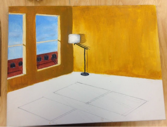
For this project I painted a scene in the style Edward hopper would have. Hopper is known for his vibrant colors, use of architecture and geometric shapes, and the loneliness of his paintings. Because of this i painted a room that was completely empty except for one lamp in the corner. I also painted windows, another common hopper feature, looking out at buildings. Even though I was painting something to look like someone else's work, I still used my own references to create an original peice.
Through this project I was able to learn new techniques and gain skill with acrylic paint. I learned how to evenly apply paint to the canvas and how to blend colors, to make the painting look smoother. If I could change anything I would have started with a wash, instead of a bare canvas.
Subscribe to:
Posts (Atom)


